Loading…


Loading…
Loading…
Loading…
Edexcel GCSE Statistics · 1ST0
Edexcel 1ST0 · 2a.02 Advanced pictorial data representation Check the specification (PDF) (opens in a new tab)
A population pyramid shows how a population is distributed across age groups. It usually separates males and females, with horizontal bars extending in opposite directions from a central age axis. The youngest groups are normally at the bottom and the oldest at the top. Despite its name, the diagram does not have to be pyramid-shaped.
Each bar represents one age group on one side. Its length shows either the frequency, meaning the number of people, or a percentage. Read the side labels rather than assuming which side represents males or females. Then find the age group and read outwards from the centre along the horizontal scale. Bars extending left do not represent negative populations.
The percentage basis matters. A bar labelled 10% might represent 10% of the whole population, or 10% of just the male or female population. These meanings are different. When all bars use the whole population as their basis, the percentages on both sides together total approximately 100%. When each side uses its own population as its basis, each side totals approximately 100%.
The following constructed diagrams represent two fictional populations. Every bar is a percentage of that population's whole population, and both diagrams use the same scale and age groups.
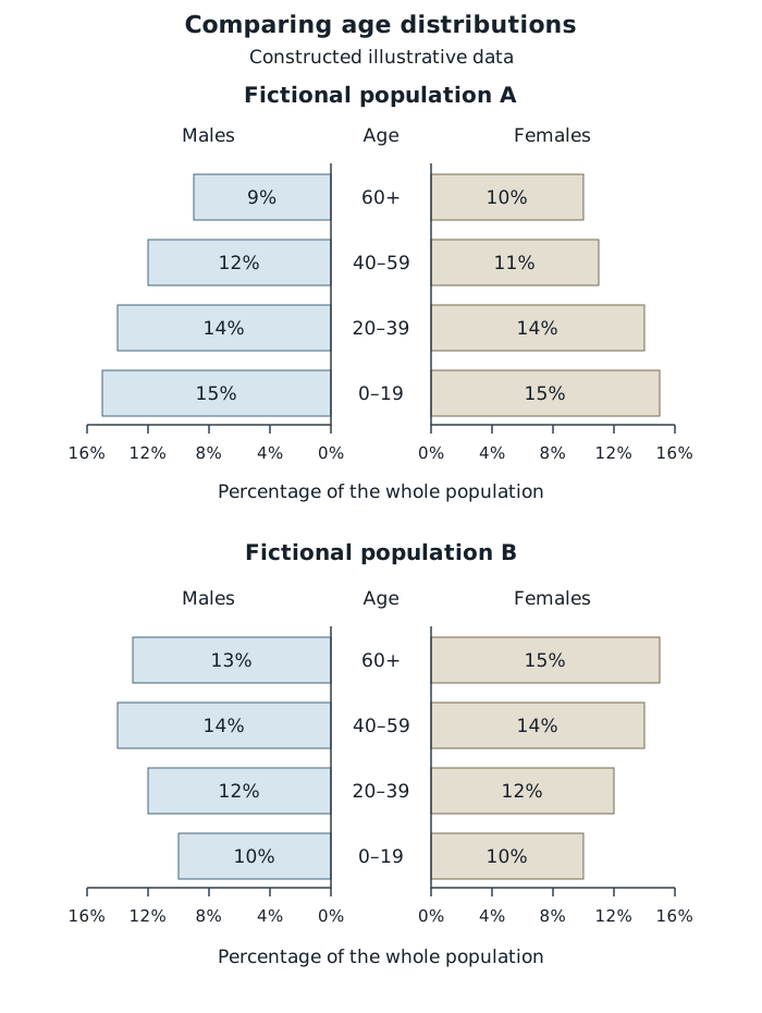
Population pyramids with a common percentage basis and scale allow direct comparison of age distributions.
In population A, the two bars for ages 0–19 are each 15%, so together this age group accounts for of the population. In population B, the corresponding total is . Population A therefore has a greater proportion of people aged 0–19.
Get unlimited access to all revision notes, key terms, and exam tips.
Check whether pyramid percentages refer to the whole population or separately to the male and female populations before adding or comparing them.
Support comparisons with particular age groups, percentages or shading intervals rather than saying only that diagrams look different.
A greater percentage does not necessarily mean a greater number of people when population totals differ.
Population pyramid
A diagram showing the distribution of a population across age groups, usually with male and female populations represented on opposite sides.
Age distribution
The way people or observations are spread across different ages or age groups.
Put your knowledge into practice — try past paper questions for Statistics
Population pyramid
A diagram showing the distribution of a population across age groups, usually with male and female populations represented on opposite sides.
For ages 60 and over, A has , whereas B has . B has a greater proportion in this older group. These comparisons explain the shapes: A is wider at the bottom, while B has relatively wider bars at older ages.
To compare a broader range, add all the relevant bars. For example, the proportion aged 40 and over in A is . In B it is . This supports the conclusion that B has a greater proportion aged 40 and over; it does not establish why their age distributions differ.
Comparing the two sides also reveals differences within a population. In B's 60-and-over group, females account for 15% of the whole population and males account for 13%. Because these percentages use the same denominator, there are more females than males in that age group.
Percentage pyramids make it easier to compare the age structures of differently sized populations, but they do not show which population has more people unless totals are also supplied.
For example, suppose A contains 10,000 people and B contains 20,000 people. Using their percentages aged 0–19, A has people in that group, while B has . A has the greater proportion, but B has the greater number.
In general:
The relevant total must match the percentage basis. A percentage of females must be applied to the female population total, not automatically to the whole population.
If percentages have been rounded, converting them into counts gives estimates rather than exact counts. Several different counts can produce the same rounded percentage. Rounding can also make displayed percentages total slightly more or less than 100%.
A choropleth map represents data for different regions using colours, shades or patterns. Each region is filled according to the interval containing its value. The regions might be geographical areas, or subdivisions of a space such as a field.
Start with the title to identify the variable and time represented. Then read the key, including its units and interval boundaries. Darker shading often indicates higher values, but the key—not the appearance alone—establishes this. On a black-and-white diagram, different patterns may be used instead of colours.
For example, if a key has intervals and , a value of 20 belongs in the second interval. Non-overlapping intervals ensure that each value has exactly one shading category.
These maps show the percentage of residents who cycle regularly in six fictional regions at two times. They use identical boundaries and an identical key. They are not maps of a real place or measured observations.
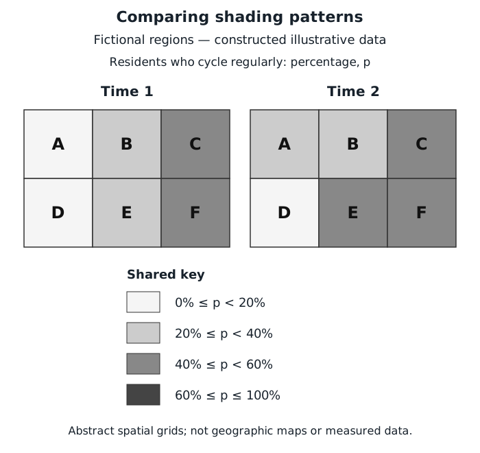
The shared key shows changes between intervals; unchanged shading does not prove an unchanged percentage.
At time 1, regions A and D are in the lowest interval, below 20%. At time 2, A has moved into the 20% to below 40% interval, while D remains below 20%. Region A's percentage has therefore increased enough to cross an interval boundary.
Region E also moves upwards, from 20% to below 40% into 40% to below 60%. At time 2, C, E and F form a group of higher-valued regions on the right of the diagram. This describes a spatial pattern without assuming its cause.
Region F has the same shade at both times. This means its value remains in the same interval—not necessarily that its percentage is unchanged. Likewise, C and F share a shade, but their exact percentages need not be equal.
On other maps, compare the keys before comparing shades. If the boundaries or intervals change, an apparent change in shading may not represent a change in the underlying value. Also distinguish the mapped variable from region size: a physically larger shaded region does not necessarily have a higher percentage or contain more people.
The same reading method transfers to authentic maps: identify the variable, read the key, locate regions, describe patterns and support comparisons with intervals. A choropleth map groups values, so it usually reveals ranges and spatial patterns rather than exact values or explanations for those patterns.
Rounded percentages produce estimated counts.
Get unlimited access to all revision notes, key terms, and exam tips.
Read each choropleth key: the same shade can represent different intervals on different maps.
Rounded percentages and grouped shading do not usually give exact numbers.
Frequency
The number of observations or people in a particular group.
Choropleth map
A map or spatial diagram in which regions are shaded or patterned according to the interval containing their data value.
Key
An explanation of what the colours, shades, patterns or symbols in a diagram represent.
The way people or observations are spread across different ages or age groups.
Frequency
The number of observations or people in a particular group.
Choropleth map
A map or spatial diagram in which regions are shaded or patterned according to the interval containing their data value.
Key
An explanation of what the colours, shades, patterns or symbols in a diagram represent.