Loading…


Loading…
Loading…
Loading…
Edexcel GCSE Statistics · 1ST0
Edexcel 1ST0 · 2a.02 Advanced pictorial data representation Check the specification (PDF) (opens in a new tab)
A pie chart divides a circle into sectors to show how a total is shared between categories. The sector angle represents a proportion: a sector occupies one quarter of the circle, so it represents one quarter of the total.
Two ordinary pie charts of the same size can compare proportions, but their size does not tell you whether their totals are equal. A quarter of 500 people is 125 people; a quarter of 1000 people is 250 people. The angles are identical, although the frequencies differ.
Comparative pie charts show both kinds of information. Each circle's area represents its total frequency, while the sector angles show how that total is divided. If one data set contains twice as many people as another, its circle must have twice the area—not twice the radius.
The area of a circle is . Squaring the radius is important: doubling the radius makes the area four times as large.
Let and be the total frequencies of two data sets, and let and be their pie-chart radii, measured in the same unit. Since area is proportional to total frequency,
The cancels because both shapes are circles. Rearranging gives the radius rule:
First divide the new total by the known total. Then take the square root of that ratio and multiply by the known radius.
For example, suppose Group A contains 200 people and has a pie-chart radius of 3 cm. Group B contains 800 people. Its total is four times as large, so its radius is cm. The radius doubles, giving four times the area.
Once the radius is correct, calculate each sector angle using that chart's own total:
In these groups, suppose 100 of Group A and 200 of Group B choose the same option. Group A's sector angle is , while Group B's is .
Draw each circle with compasses, then use a protractor to draw its sectors. Use matching colours or shading for matching categories, and provide a key and clear group labels. The sector angles in each circle should total .
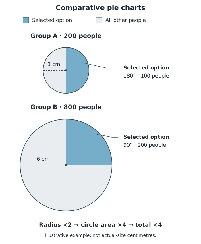
Comparison: Group B has four times the total and twice the radius. Its selected-option sector has a smaller angle but represents twice as many people.
The selected option occupies half of the smaller circle but only a quarter of the larger circle. Nevertheless, its frequency is twice as large in Group B. Its sector area is therefore twice as large too.
Keep two questions separate: what fraction belongs to a category, and how many observations belong to it.
Compare angles to compare proportions. Compare circle areas to compare totals. For a category frequency, combine the sector's proportion with its chart's total:
where is the sector angle and is that chart's total frequency.
You can also recover a missing total from the radii:
For example, in a constructed comparison, a chart of radius 4 cm represents 320 people. A second chart of radius 6 cm represents people. The radius increased by a factor of 1.5, but the total increased by a factor of 2.25.
Pictorial comparisons may use other shapes instead of pie charts. Read the title, labels and key to establish whether the quantity is represented by a length, an area or a volume. The same change in length has different effects on these measures.
For similar two-dimensional shapes, corresponding lengths have the same scale factor. If every length is multiplied by , the area is multiplied by . This happens because both dimensions change: for a rectangle, area is length multiplied by width.
For an area-scaled comparison, squares with sides 2 cm and 4 cm have areas 4 cm² and 16 cm². If their areas represent frequencies, the second frequency is four times the first—not twice it.
This also explains how a diagram can exaggerate a difference. If a designer doubles both the height and width of a picture to represent twice the frequency, its area actually becomes four times as large. An area-scaled picture should instead have twice the area. Do not assume that a picture twice as tall represents twice the quantity.
For similar three-dimensional objects, multiplying every length by multiplies the volume by . For a cuboid, all three dimensions contribute: volume is length multiplied by width multiplied by height.
For example, cubes with sides 2 cm and 4 cm have volumes 8 cm³ and 64 cm³. If their volumes represent frequencies, the frequency ratio is . The larger cube represents eight times the quantity, although its edges are only twice as long. Doubling every dimension to represent twice the quantity would therefore exaggerate the difference in a volume-scaled comparison.
These square and cube examples demonstrate scaling. When interpreting an actual diagram, use its stated encoding and labels. A solid-looking object used in place of a bar might represent data by height only, rather than by volume. Its key determines the intended comparison.
Perspective introduces a separate difficulty. In a tilted, three-dimensional-looking pie chart, sectors at the front can appear larger than equal sectors at the back. That visual effect does not establish that their frequencies are larger. Use labelled angles, percentages or frequencies to make the comparison, rather than the apparent size of the visible faces.
Get unlimited access to all revision notes, key terms, and exam tips.
For total frequencies and radii :
For similar shapes with length scale factor :
Check whether quantities are represented by length, area or volume. Three-dimensional perspective can distort apparent size; use the stated values.
Get unlimited access to all revision notes, key terms, and exam tips.
For comparative pie charts, scale the area, not the radius: multiply the radius by the square root of the total-frequency ratio.
Compare sector angles for proportions and sector areas for frequencies. A larger angle does not necessarily represent more people.
Only measure a diagram when it is stated to be drawn accurately or to scale. Otherwise use the supplied values.
Check what represents the data in a pictorial comparison: length, area or volume. These give different scale factors.
Comparative pie chart
A set of pie charts whose circle areas are proportional to the total frequencies represented, allowing both totals and category proportions to be compared.
Total frequency
The sum of all category frequencies in a data set.
Sector
A part of a circle bounded by two radii and an arc. Its angle determines the proportion represented in a pie chart.
Proportion
A part expressed as a fraction of the whole. In a pie chart, a sector with angle represents the proportion .
Radius
The distance from the centre of a circle to its circumference.
Scale factor
A number by which a measurement is multiplied. For similar shapes, multiplying lengths by multiplies areas by and volumes by .
Put your knowledge into practice — try past paper questions for Statistics
Comparative pie chart
A set of pie charts whose circle areas are proportional to the total frequencies represented, allowing both totals and category proportions to be compared.
Total frequency
The sum of all category frequencies in a data set.
Sector
A part of a circle bounded by two radii and an arc. Its angle determines the proportion represented in a pie chart.
Proportion
A part expressed as a fraction of the whole. In a pie chart, a sector with angle represents the proportion .
Radius
The distance from the centre of a circle to its circumference.
Scale factor
A number by which a measurement is multiplied. For similar shapes, multiplying lengths by multiplies areas by and volumes by .